

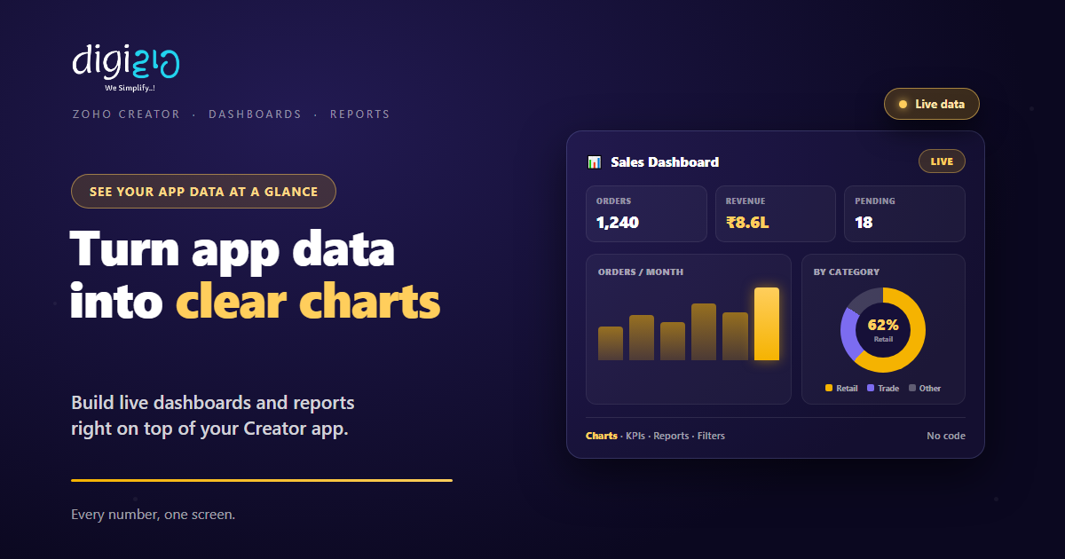
Zoho Creator Dashboards: Turn App Data Into Clear Charts
Your Creator app already holds the numbers. So a dashboard turns them into charts, KPIs, and reports you can read at a glance.
Last Updated: July 2, 2026
A Zoho Creator dashboard shows your app data as charts and key numbers on one screen. So instead of scrolling through rows, you see the story at a glance. Plus, you build it without code. As a result, the data your app collects finally turns into decisions.
This matters because collecting data is only half the job. After all, orders, leads, and tickets pile up fast. But raw records rarely answer “how are we doing?” So reports and dashboards close that gap.
Key Takeaways
- Data becomes charts. Reports turn app records into pie, bar, and line charts.
- One screen. A dashboard groups KPIs and charts in a single view.
- No code. You drag and drop fields to build it, not write queries.
- Ask Zia. Ask a question in plain English and Zia charts the answer.
- Share safely. Role-based views show each person only their data.
Table of Contents
- What Are Dashboards and Reports in Zoho Creator?
- Why Your App Data Needs a Dashboard
- Report Views: More Than Just a List
- Charts That Make Numbers Make Sense
- Building a Dashboard Without Code
- Ask Zia: Insights in Plain English
- Sharing Reports the Right Way
- Raw List vs Dashboard
- How to Build a Dashboard in Zoho Creator
- A Dashboard in Action
- Frequently Asked Questions
- Conclusion
What Are Dashboards and Reports in Zoho Creator?
A report is a view of your app data. So it takes the records in a form and presents them in a useful shape. That shape might be a list, a calendar, a map, or a chart. In short, one set of data, many ways to look at it.
A dashboard goes one step further. It gathers several reports and key numbers onto a single page. As Zoho puts it, you can “create insightful dashboards for your team.” So a manager opens one screen and sees the whole picture. Because Zoho Creator is a low-code platform, both are built by dragging, not coding.
Why Your App Data Needs a Dashboard
Every Creator app fills up with records. For example, orders, site visits, leave requests, or support tickets. So the data is there. But a long table rarely tells you what is going well or badly.
A dashboard answers the real questions. So you see totals, trends, and outliers in seconds. Meanwhile, the team stops exporting rows into spreadsheets by hand. In fact, that saved effort is the whole point of building the app in the first place.
There is a trust angle too. Because everyone reads the same dashboard, they share one version of the truth. So meetings argue about the decision, not the numbers.
Report Views: More Than Just a List
The same records can appear in many forms. So Creator lets you present a table of data in whatever view fits the job. Then the reader picks up the pattern faster.
List & Grid
See records row by row, sorted and grouped. So it works like a smart, filtered spreadsheet.
Kanban Board
Track items as cards across stages. So a workflow like leads or tasks is easy to follow.
Calendar
Plot dated records on a calendar. So bookings, shifts, and deadlines sit in context.
Charts & Maps
Summarize the data as charts or on a map. So totals and trends jump straight out.
So one dataset serves many readers. For example, an ops lead lives in the kanban view, while the owner watches the chart. In short, you choose the view that answers the question.
Charts That Make Numbers Make Sense
Charts are where a dashboard earns its keep. So Creator offers “over 40 types of charts” to fit almost any data. Then you match the chart to the message.
A pie or ring chart shows share, like sales by category. Meanwhile, a bar chart compares months or teams side by side. A line chart tracks a trend over time. Plus, there are funnel, scatter, bubble, and even map charts for location data.
Best of all, the chart stays live. So when new records arrive in the app, the chart updates with them. As a result, the dashboard reflects today, not last week.
Building a Dashboard Without Code
You do not need SQL or a data team here. So building a report starts by picking the fields you care about. In Zoho’s words, you “drag and drop fields” to shape the view.
From there, you choose the chart type and how to group the data. For example, group orders by month, then sum the amount. Next, you drop a few of these reports onto one page to form the dashboard. So the layout is yours, built by hand but without a single line of code.
Because it is that simple, the person who knows the business can build the view. So you are not stuck waiting on developers for every new report. For deeper number-crunching across many apps, you can also pair Creator with Zoho Analytics.
Ask Zia: Insights in Plain English
Sometimes you just want an answer fast. So Creator’s AI assistant, Zia, lets you ask in plain words. As Zoho describes it, you can “turn massive datasets into charts—ask questions in plain English to our AI and get powerful insights instantly.”
For example, you type “orders by city this month,” and Zia draws the chart. So you skip the setup and get straight to the insight. Then, if the chart is useful, you keep it on the dashboard.
This lowers the bar even further. After all, not everyone thinks in fields and groupings. But most people can ask a clear question. So Zia turns that question into a picture.
Sharing Reports the Right Way
A dashboard is only useful if the right people see it. So Creator makes sharing quick, yet controlled. You can “share in a click,” but each viewer sees only what they should.
That control comes from role-based views. So a salesperson sees their own deals, while the manager sees the whole team. In Zoho’s words, people “access only the data they need through role-based views.”
Role-Based Views
Each user sees only their slice of the data. So sharing never leaks the wrong numbers.
Export, Email, Print
Send a report out as PDF, CSV, or Excel. So a board pack or client update is one click away.
On Mobile
Creator apps run on iOS and Android too. So the dashboard travels in your pocket.
Connected Data
Pull in data through 1000+ integrations. So one dashboard can span several tools.
Raw List vs Dashboard
Both show the same records. But they answer very different questions. So the table below sums up the shift.
| Question | Raw List of Records | Dashboard |
|---|---|---|
| How are we doing? | Scroll and guess | One glance at KPIs |
| What is the trend? | Not visible in a table | A live line or bar chart |
| Which category leads? | Count rows by hand | A pie chart shows the share |
| Who sees what? | All rows or nothing | Role-based views |
| Getting the answer | Export to a spreadsheet | Already on screen |
So a list is fine for finding one record. But a dashboard is how you run the business. In short, one is for lookup, the other is for decisions.
How to Build a Dashboard in Zoho Creator
Building your first dashboard takes minutes, not days. So here is the path from raw data to a clear screen.
-
1Start from your app data
First, open the form that already collects your records. So the report has real data to draw on. -
2Create a chart report
Next, add a report and pick a chart type, such as bar or pie. So the numbers become a picture. -
3Drag and drop the fields
Then choose what to plot and how to group it, like amount by month. So the chart answers a real question. -
4Add a dashboard page
Now place a few reports and KPI numbers on one page. So the whole story sits in a single view. -
5Share with the right roles
Finally, share it and set role-based access. A Zoho partner can tune the permissions for you.
Pick one number your team asks about every week. Then build a single chart that answers it.
A Dashboard in Action
Steps are clear. But a real story sticks. So here is how one team turned a busy app into one useful screen.
The sales team logged every order in a Zoho Creator app. So the data was complete, but nobody could read it fast. Each Monday, someone exported rows into a spreadsheet just to count them. Then they built a dashboard. Now one screen shows orders this month, revenue, pending shipments, and a bar chart by product. Meanwhile, Zia charts any odd question the owner asks. As a result, the Monday export is gone, and the team reads the same numbers in seconds.
In short, the app did not change what it collected. Instead, the dashboard changed how the team saw it. So the data finally started earning its keep.
Frequently Asked Questions
What is a dashboard in Zoho Creator?
A dashboard is a single page that gathers charts, KPIs, and reports from your Creator app. So instead of scrolling through records, your team sees totals, trends, and key numbers at a glance.
Do I need to code to build reports and dashboards?
No. Zoho Creator is a low-code platform, so you drag and drop fields to build reports. You pick a chart type and how to group the data, then place a few reports on one page to form a dashboard.
What chart types does Zoho Creator support?
Creator offers over 40 chart types, including pie, ring, bar, line, funnel, scatter, bubble, and map charts. So you can match the chart to the question, whether that is share, trend, or comparison.
Can I ask Zia to build a chart for me?
Yes. Zia lets you ask questions in plain English and turns large datasets into charts instantly. So you can type a question like “orders by city this month” and get a chart without setting it up by hand.
How do I control who sees a report?
You share reports with role-based views, so each person accesses only the data they need. A salesperson sees their own records, while a manager sees the whole team. You can also export, email, or print any report.
Are dashboards part of Zoho Creator?
Yes. Reports and dashboards are built into Zoho Creator, alongside forms and workflows. For heavier analytics across many data sources, you can also connect Zoho Analytics.
Conclusion
In the end, a dashboard is how your app data starts talking. So the records you already collect turn into charts, KPIs, and clear answers. After all, data you cannot read is data you cannot act on. But Zoho Creator makes reading it a drag-and-drop job.
First, pick one question your team asks often. Then build a chart that answers it. Next, gather a few charts onto a dashboard and share it by role. That way, everyone sees the same picture, on any device.
Think about your busiest Creator app. What would one clear screen of its numbers change this week?
Want dashboards and reports built around the way your business runs? Talk to a Zoho Authorized Partner.
